
Available in Enterprise
EARLY ACCESS: If you're interested in using this feature and you're on the Enterprise plan, reach out to your Success Manager, who can activate this for you.
---
There are three ways to preview publications across all device types:
- Publication Previewer built into Publitas CMS
- Using a real device.
- Using Chrome Dev tools or other browser tools
Using a real device for preview
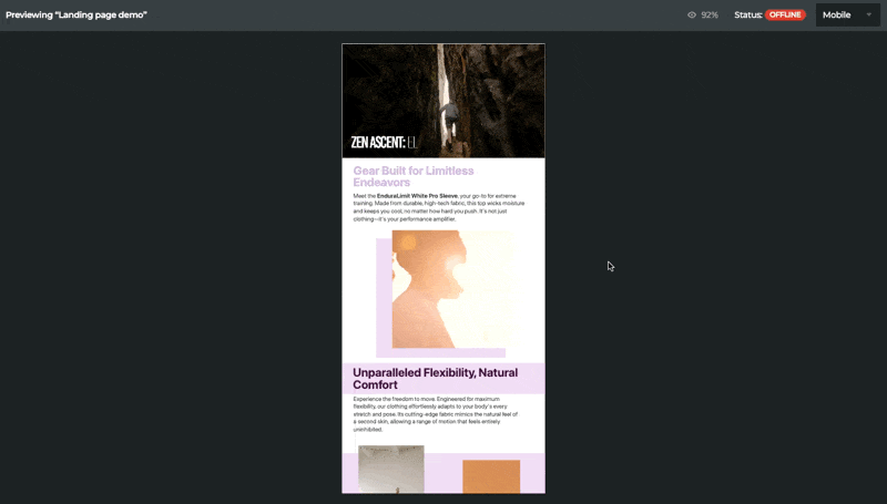
Publication Previewer is a built-in app of Publitas CMS that allows you to preview a publication on Mobile, Tablet, or Desktop. By clicking preview from the publication list, Editor, or publication settings, the Previewer opens with the mobile view first. You can select the device type in the upper right corner to switch between Mobile, Desktop, and Tablet modes.
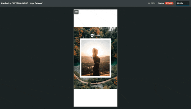
For Landing pages, Previewer will simulate having the landing page embedded in a website with a bit narrower appearance, not utilising the full width of the browser window.
As the Previewer app replaces the live preview with publication link, to obtain the publication link for sharing, you can click on the Share button in the Publication list and then click Copy to clipboard. This link can be used to share and embed the publication when ready to publish online.

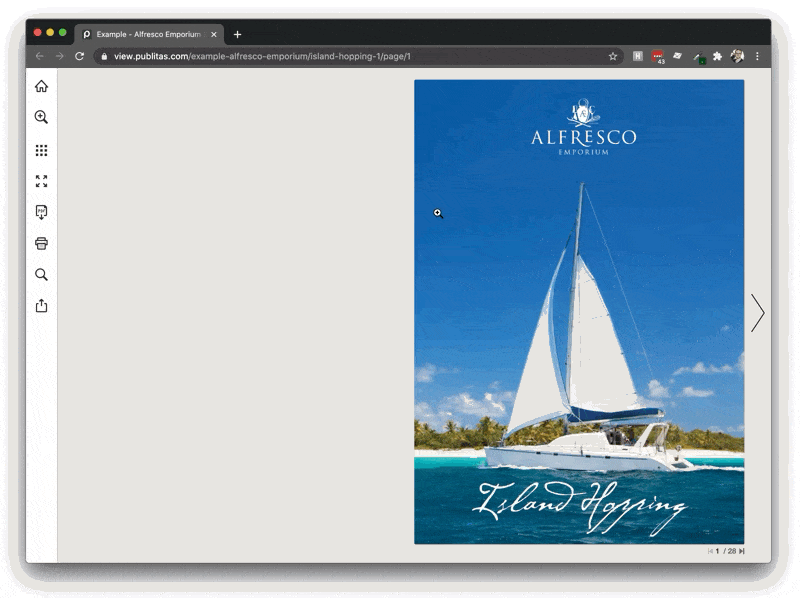
Using a real device for preview
The easiest way to preview your publication on a real mobile device is to publish the publication online (either Public or Unlisted) and load the publication URL in your mobile browser. Offline publications can only be viewed when you are logged in on your Publitas account. You can go to app.publitas.com on your test device to log in. Please note that not all options in the CMS support touch screens (e.g. hotspot editor). Click here to learn more about supported browsers.
Using Chrome's developer tools
The Chrome browser offers a way to emulate a mobile or tablet device:
- Use the keyboard shortcut Ctrl Shift J (on Windows) or Cmd Option J (on Mac) to activate the Developer tools.
- In the top-left corner, click on the touch device icon.
- At the top of the webpage, select the type of device you want to emulate.
- Refresh the page
Using Chrome to emulate the mobile Reader:
In reality, the Publication Reader is less tall as the internet browser takes up space at the top and bottom. These elements do not show in Chrome.
Other online test tools
There are many tools available online that allow you to test web pages on a virtual device of your choice. A few examples you can check out are BrowserStack and CrossBrowserTesting.
Screenshot from a live session in BrowserStack:
.png?width=367&height=579&name=mceclip0%20(1).png)
Reader comparison
The Reader's interface and options are optimized for the device that is used to view the publication. Here's an overview of the main differences between the device-specific interfaces:
| Desktop Reader | Tablet Reader | Mobile Reader | |
| Navigation | Clickable arrow buttons next to and below the pages or scrolling vertically for landing pages | Swiping gestures | Swiping gestures |
| Zoom options | Page clicks; Menu option | Pinching gestures and double tap | Pinching gestures and double tap |
| Menu availability | Visible on the left, or hidden for Landing pages | Visible on the left, or hidden for Landing pages | Activated via a hamburger icon, or hidden for landing pages |
| Share options | Menu option; Product hotspots | Native share (via the browser) | Native share (via the browser) |
| Product hotspots | Pop-up window with a sidebar when multiple products are present | Pop-up window with a sidebar when multiple products are present | Slide-in window, showing a product overview first when multiple products are present |