
The biggest difference between viewing publications on a laptop or desktop and viewing the same content on a mobile device is, of course, the size of the screen. For the past couple of years, we have seen an upward trend in online shopping on mobile devices. In 2020, mobile web traffic accounted for 70% of all online sales, with 30% coming from desktops (read more).
This article will help you adapt your publications to this trend and change the way your pages are displayed on mobile displays.
In this article:
- How publications are displayed on mobile
- Having pages fit the mobile screen
- Showing single pages on mobile for booklet publications
- Enabling vertical scroll on mobile
How publications are displayed on mobile
There are two different types of layouts you can select for your online publications: Single-page and booklet. By default, the publication will use the selected layout on both desktop and mobile devices.
For single-page publications, each page is displayed individually. Booklet publications will first show a cover page on mobile where all consecutive pages are 'spreads,' finishing with a separate back page. On mobile, a swiping gesture is used to navigate from one page to the other or from the cover page to the first spread.
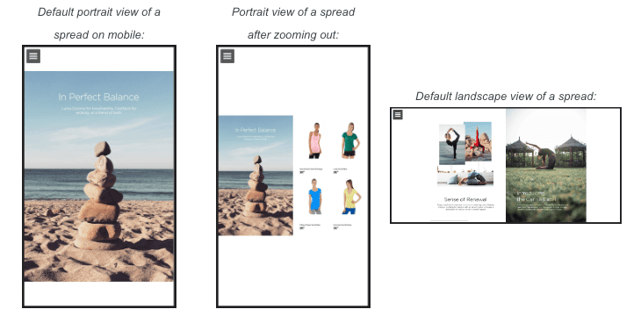
Because the spreads in booklet publications consist of two pages, the reader will automatically snap to one side of the spread in case the mobile device is in the portrait orientation. With a pinching gesture, you can zoom out to see the entire spread. This can also be achieved by rotating the device to its landscape orientation.
By default, the reader will make the content of a single page fit onto the mobile screen. If this is not the case for your publications (e.g., the setting has been changed in the past), we recommend selecting the Fit content option in the Display & Formatting tab of the Publication Reader menu.
Locating the Page layout setting: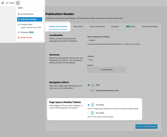
The alternative 'Fill content' option will always fill the screen from top to bottom, which case results in pages being partially visible. Even though the user can drag the page or zoom out to see the rest of the page, it is not a recommended option.
Showing single pages on mobile for booklet publications
A booklet publication closely resembles a traditional
book that you read from left to right or vice versa. For
the best experience, you, therefore, need a wide screen
that allows you to view the entire spread as soon as it
comes on screen. Although mobile devices can rotate
sideways, most users prefer the upright position as
most mobile activities happen during the orientation, and it
allows for single-handed operation.
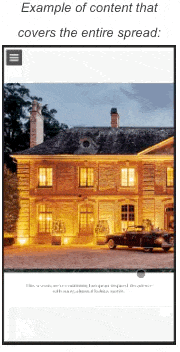
In the portrait orientation, two kinds of swiping
interactions are used by the reader. One that will take
you to the next spread and another to slide between
the two sides of a spread. The latter is necessary
in case you have content that covers the entire spread.
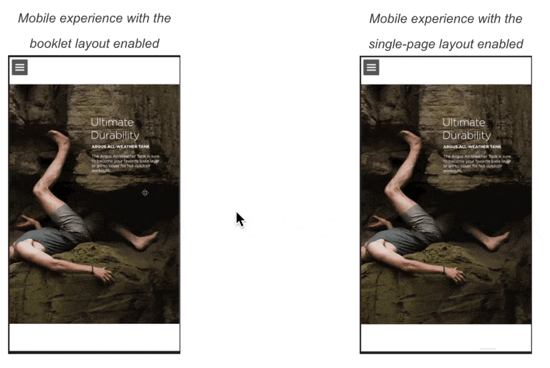
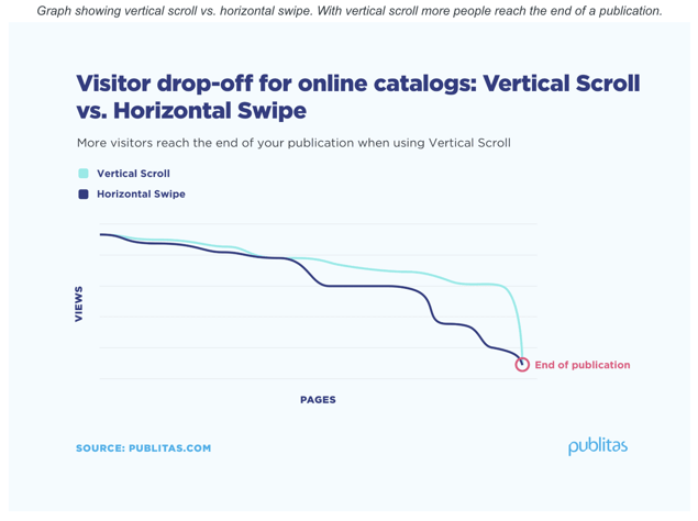
If you look closely at the examples below, you'll notice that in the left example, some pages snap into place in an instant (i.e., navigating to the next spread) whereas the other pages slowly settle into place (i.e., navigating to the second page of a spread). In the single-page experience on the right, all pages snap into place immediately, creating a more consistent user experience.
Enabling single pages on mobile for booklet publications: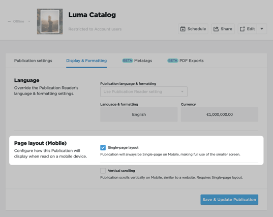
Enabling vertical scroll on mobile ![]()
![]()
EARLY ACCESS: If you're interested in using this feature and you're on the Enterprise plan,
feel free to reach out to your success manager, who will activate this for you.
In this digital age, we spend a good portion of our time scrolling through online content. The majority of the media, like news sites and social media, use vertical scrolling to present its content. In Publitas, you can enable mobile vertical scrolling for online publication as well.
Using Vertical Scroll on mobile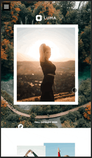
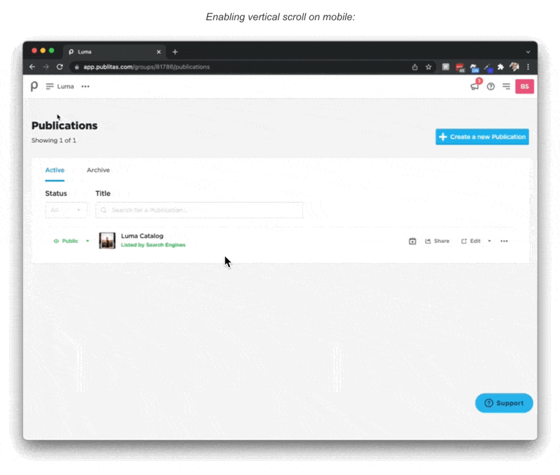
You can enable the setting on group-level in the Display & Formatting tab of the Publication Reader menu, which will enable it for all publications within that group. You can also apply the setting per publication, which can be done through the publication's Settings menu under the Display & Formatting tab.
NOTE: To enable this for booklet publications, you will first need to enable the single-page layout on mobile, which will split up the spreads into two separate pages.