Branding your Publication Reader
Available in Silver, Gold & Enterprise
We believe your publications look best when the Publication Reader truly expresses your brand. Make sure to read on as we share some inspiring examples of how our customers are using our branding features to improve the look of their publications.In this article:
- Adding a background image, favicon, or logo
- Using custom hotspot icons
- Setting up a custom domain
- Examples
Adding a background image, favicon, or logo
Click the top-left triple dots (...), then click on Content Presentation Settings -> Reader Branding. Here, you can easily add a background image, favicon, or logo to your publications. Any changes you make here will be applied to all the publications in your group.

Using custom hotspot icons
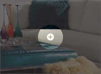
Click the top-left triple dots (...), then click on Content Presentation Settings -> Hotspot Settings. Here you can upload custom hotspot icons. Again, any changes you make here will be applied to all the publications in your group.
Make sure to upload both the normal size (36x36 px) and a high-resolution version of the icon (72x72 px) for the best results across all types of screens.
Setting up a custom domain
Replace the standard Publitas domain with a domain of your own. Click here for more information or reach out to our support team to start connecting your domain right away.
Examples
Here is a beautiful example from Gall & Gall, a Dutch liquor store.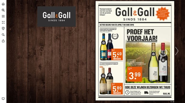
By combining the modern design style of their logo with a warm, wooden background, they immediately express their unique brand. Another thing they’ve done to highlight their brand in the publications is using custom product hotspot icons. 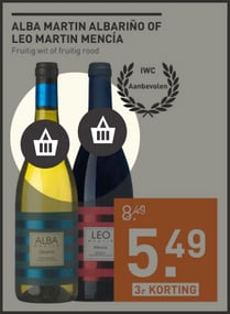
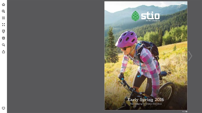

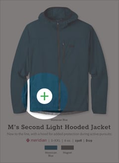
Here’s an example from Pottery Barn, a home decor brand: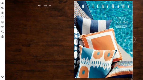
Their dark wooden background creates a sense of luxury while also making sure their publication stands out due to the added contrast. They’ve also added their logo to make sure that the Pottery Barn brand is immediately recognized.
Last but certainly not least, here’s an example from Z Gallerie, a fashion-forward lifestyle brand focused on the home: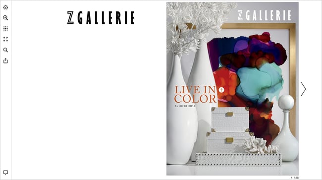
The unique Z Gallerie logo is immediately visible, and they've added custom hotspot icons using their main brand color. Another important feature they're using is the custom domain. Instead of using view.publitas.com in the URL of their publication, they've changed that to catalog.zgallerie.com. This not only aligns better with their branding but also improves the rankings of their online catalogs in search engine result pages.