Applying and positioning hotspot icons optimally
When it comes to positioning icons, we believe there are three simple rules to make sure your icons are always positioned in a logical way that enhances the user experience.
1. Touch the edge of a product, but don't cover it up
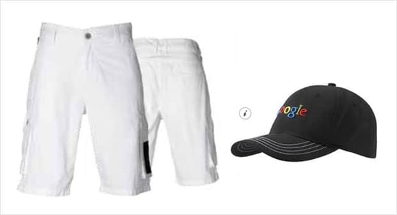
It's important to make sure the hotspot icon and its mouse-over text are placed in a logical position without obstructing or covering important details of the product. Placing the icon in the center of the product will draw attention away from the image, so try and position the icon on the edge of the product whenever possible.
Example of correct and incorrect icon placement, respectively:
Another mistake that often confuses users is floating icons. These icons are disconnected from the product they belong to, making it look like they're just floating on the page.
Example of a floating icon. Can you guess which product this icon belongs to?
2. Create sufficient space
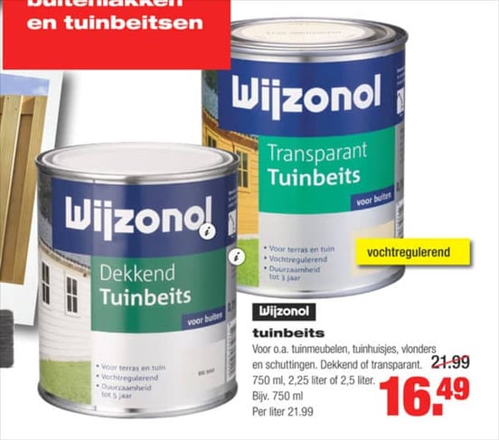
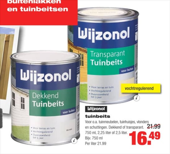
It's also important to ensure that icons aren't touching or stacked on each other. You can do this by creating space between icons to avoid confusion and clarify which icon belongs to which product.
Example of icons that don't have enough space between them:
As you can see in the example above, it's not instantly clear which icon belongs to which product. This is much clearer:
Example of icons with enough space between them:
3. Be consistent
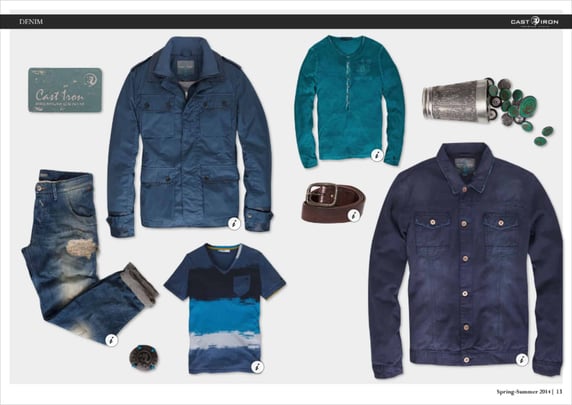
Perhaps the most important rule for positioning your icons is consistency. It's foundational to a good user experience and also helps shoppers quickly identify which product belongs to the icon.
Consistent icon placement:
Here's how not to do it:
Inconsistent icon placement:
