
Available in Enterprise
EARLY ACCESS: If you're interested in using this feature and you're on the Enterprise plan, reach out to your Success Manager, who can activate this for you.
---
Create inspirational landing pages, sections or banners for your website easily by embedding content that automatically adapts to the device it is being viewed on. With Adaptive content, you design once, tweak per device and let Publitas handle the rest.
Unlike traditional PDFs and page-based content that looks the same on every device, Adaptive content adapts to different screen sizes - just like how a modern website looks different on your phone versus your computer. Think of it like the difference between a printed poster (PDF) and a flexible display that reshapes itself perfectly whether viewed on a phone, tablet, or desktop computer.


How to start
To create new publication with adaptive content, follow these simple steps:
- Log into your Publitas account
- Select Create from scratch option in the upper right corner of the publication list.
- Select "Adaptive content" as the Content type.
- Provide a name for your new publication.
- Click Confirm settings & create publication.
Your new publication will be created and the Adaptive Content Editor will open.
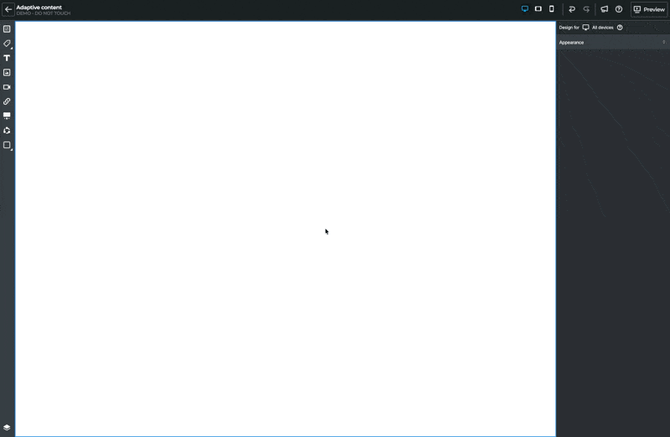
Introduction to the Adaptive content Editor
When you start creating new content, you will see three main areas:
Left toolbar - content toolbox
Think of your content toolbox as a starting point for anything you want to add to canvas to start creating content. It contains:
- Sections as pre-built content layouts (like slide templates)
- Content blocks - individual building blocks such as text, images, product blocks, etc.
- Layers panel - shows the structure of your content and allows easy reorganization.
Canvas - your working area
This is where you build your content. Start by selecting a pre-built or a blank section, then add and/or customize content blocks in it.
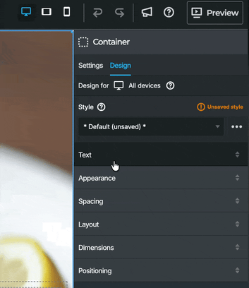
Right panel - Settings and Design options
When you select any element, this panel shows all the ways you can customize it, fonts, colors, spacing and much more.

Working with sections
Think of sections like pre-designed slide layouts in PowerPoint. Instead of starting with a blank page, you can choose from ready-made layouts that already look professional.
On top of that, any custom-made sections can be saved for later reuse as well.
How to add your first section
- Drag the Add a section block onto canvas.
- Select one of the sections from the list of pre-built sections, or select Blank section.
- Confirm the selection.
You can repeat these steps whenever another section is needed. Blank sections are available straight from the toolbar as well, and by clicking the "Add section" on top or below the existing sections straight in the canvas.

Layering system
The Layers panel (bottom of the left toolbar) shows you the structure of your content.

To understand a bit better (the) overall content structure, consider the following order as a guideline:
- Body - this is default level and represents the entire publication;
- Section - each major content block within the publication should be container by a section
- Container/row/cell - Organizational elements within sections providing further structure and separation of content
- Blocks - Individual blocks such as text, image, etc that represent the single individual piece of content with no further structure in it.
In addition, there are a few specialized content blocks that can contain further structure, such as:
- Product block - a specialized block where individual blocks are tied to a selected product with content updating automatically.
- Carousel - a specialized block containing multiple slides each acting as a container in itself with further content in it.
Content blocks
Text elements
Add and format text just like in any word processor:
- Font selection and sizing
- Alignment
- Colors and styling
- Line height and letter spacing
Images and Videos
- Upload from your computer - Files are saved in your media library for reuse
- Drag and drop directly onto the canvas
- Add an image or video from a link
- Customize image through cropping, rotation and background removal.
Products (Connected to Your Product Feed)
When you add a product element:
- Automatic information pulling - Title, price, description, images
- Smart linking - Automatically links to product pages
- Live updates - Changes in your product feed update automatically
Carousels (Image Sliders)
Carousels allow you to showcase product images and other types of content in a swipeable or auto-rotating content strip, making it perfect for dynamic, high-impact storytelling on your landing page. With carousels you can:Add multiple items - Images, videos, products, or text
- Define navigation options: Dots, arrows, or both
- Animate the content: - set auto-play and looping
Adaptive/responsive design: Why it matters
Notice the "Design for: All devices" label in the design panel? This ensures your content looks great everywhere, with default setup being:
- Desktop computers - Full layouts with multiple columns
- Tablets - Adjusted spacing and sizing
- Mobile phones - Stacked layouts.
The system automatically handles these adjustments, but you can fine-tune for specific devices if needed. Start with desktop and then move down to tablet and lastly mobile to make adjustments as they trickle down in this order. But a change on mobile will not impact tablet or desktop. This enables you to fully customize the appearance and the layouts for each device separately.
Design basics
Each block selected in the canvas can be customized and the options vary based on the type of content. Below is a brief overview of design options.
Text Styling
- Font and size
- Alignment - Left, center, right, justified
- Color - Text and background colors
- Style - Normal, bold, italic
Appearance Controls
- Show block - Toggle to hide/show background
- Background color - Set element background
- Background image - Set an image as a background for the block.
- Opacity - Make elements transparent
- Borders - Add frames around elements
- Border radius - Create rounded corners
Best practices
- Start with sections - Modify existing sections rather than building from scratch
- Save frequently - Create a library of your favorite layouts
- Test on different sizes - Use the preview function to check appearance across desktop, tablet and mobile.